Excel Like a Champ pt. 3: How to Make Easy Graphs
Hey guys! I know it’s been some time, and I’m so happy to be back with all of you here today to work towards becoming excel PROFESSIONALS.

I hope you have been practicing your basic excel skills and are ready to put them to use to start analyzing data. Today, I want to run through some tricks and tips about the first basic way to analyze data- putting it in a graph to make inferences and see patterns. I am going to talk you through this so you can see how you can easily make graphs from data on excel, and how you can use those graphs to do basic analysis of the data.
Writers Note: A lot of this might seem intuitive since we are using such a small amount of sample data to practice this, so you may be like, well Zoe, I don’t need a graph to tell you the various obvious patterns seen in this data. And you would be absolutely correct. In this case with the data sets we are using, you wouldn’t really need to make a graph or do anything that fancy to try to understand it. However, I just wanted to remind you that in real life, you may be working with 100s or 1000s of data points, and using a graph may be the most logical way to analyze that large amount of data. So bare with me- this might seem obvious but it’s important to know how to do the graph and read it properly so when you have a lot of data, you can do it then as well.
First, I want you to open back up your completed excel documents with all of the data, and that should look like this:
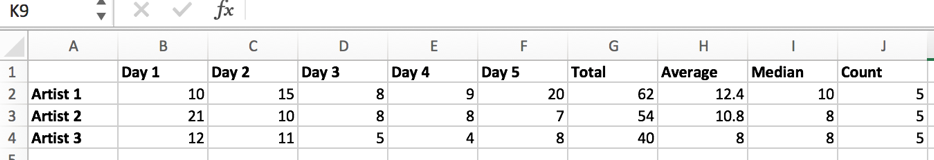
What you are going to do is highlight all of the columns from row A to row H, aka all the data you want included in the chart (for these purposes, we aren’t going to look at median or count). Once that is highlighted, you should hit “insert” on the top of the excel tabs, and then you can click “Recommended Charts.” Your data must still be highlighted in order for this to work. You will then have several different types of charts you can choose from, including bar charts, pie graphs, histograms, scatter plots, etc. I’m not going to go into detail about each graph or when you should use each, but you can read more about that on this blog post:
https://blog.hubspot.com/marketing/types-of-graphs-for-data-visualization
I encourage you to play around with the graphs and to see which makes the most sense to read you for this particular data. To be transparent, that’s normally how I ultimately decide what graph to go with. For now, lets use the “clustered column graph.” Once you hit that, the graph will appear on the same excel sheet, and will look like this:
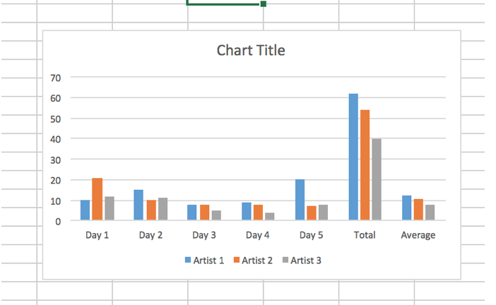
The reason this is so effective is because it quickly makes our graph for us where we don’t need to do any work. This clearly shows us visually what the data looks like and we can make quick inferences. Right away, we can see that Artist 1 had the highest total and average for song sales, and we can see that Day 5 was the best sales day for them. We are also easily able to compare this to the artists. Within seconds, I can visually see the comparisons between them, make inferences, and see conclusions about song sales within the past 5 days.
In this particular context, since the data sample is small and simple, we are able use a very simple graph. However, excel has features where you can change the graph to make the information clearer. For starters, you can even just change the font, size, and colors of the graph. I know I need to do this at work if I want to put the graph in a PowerPoint, and want it to match the theme. Double click on the graph, and then it will bring you to a tab that is called “Chart Design.” At the top, you will see a bottom that says, “Change Colors,” and you can click that to adjust the colors to whatever you would like.
Say that you want to add a label for each value on the graph, you can do that easily as well. Hit at the top “Add Chart Element,” and several options will show up. This will allow you to add several elements on the graph within seconds. For example, You can hit, “Data Labels,” and it will give you options on where to place the labels. For now, press “Outside End,” and then the values of each point will show up on top of the bar so it is easy to read and you can see the exact value.
You can also hit “Quick Layout,” next to “Add Chart Element,” which gives you options on how you want the actual layout of your graph to go. Do you want the color key to be at the bottom, top, side, etc.? With this tool, you can change it around for your preferences. At the top of the excel sheet, there is the option to “Switch Row/Column,” if you wanted to have the Artists on the Chart and the Days as the key. That would make this specific graph confusing, but this could be a helpful tool depending on what data set you are working with. There is also an option at the top that says, “Change Chart Type,” which you can press to instantaneously format the data into a different chart. This is useful if you want to play around and see which type of chart is most effective for this specific data set.
These aren’t all of the tools under “Chart Design,” only a few that I find most relevant. Again, I would encourage you to just play around with all of them, including the ones I didn’t mention. This will give you experience on how to quickly make a graph on excel. It’s crucial to understand the various tools excel has that allows you to manipulate the data within the graph to make it as readable and clear as possible. This is important because the easier it is to understand your graph, the easier it will be to analyze the data and to draw some inferences and conclusions based on this data.
I know this post today was pretty long and pretty full of content (and not enough jokes in my opinion). However, I think the graph tool on excel is highly under utilized, and if you guys want to truly become excel pros, it’s important to understand how to work with graphs to your advantage.
That is all I have for today- thank you for sticking it out with me. I love you all.
Until next time, future excel champs,
Your favorite excel teacher, Zoe