Excel Like a Champ pt. 5: How to Use the Powerful Pivot Table

WELCOME BACK, my beautiful excel users. I hope everyone has had an amazing Thanksgiving, and hope you are just as excited as I am to gather here together to learn more tips and tricks for excel. Today is very exciting because we are going to be learning how to use what is frequently called one of the most powerful tools on excel, PIVOT TABLES.
While this might not sound that exciting or fancy, pivot tables can be such an asset to you if you are analyzing a large amount of data because they allow you to quickly and efficiently summarize a data set. Personally, I used pivot tables a lot while I was working at CMA as a consumer research intern in order to check inconsistencies, identify issues in the data, and quickly have a summarization. This was especially useful because I was dealing with 1000s of data points, and it gave me access to a snapshot of information within seconds. Now, let’s begin the fun!
Note: Just to emphasize, pivot tables are not to look at specific individual data points, but rather just a larger and broader summary of big data sets
To start, go to the excel worksheet we have been using with all of our inputted data for all of the artists. Highlight all of the data, and then click the insert tab at the top of the page. Once you did that, hit the first option which is “PivotTable.”
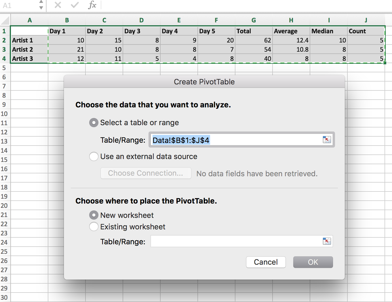
This is what will pop up, which is where you will input the specific information for what you want included in this PivotTable. For the table of range, use the range in the picture, or “Data!$B$1:$J$4.” This lets excel know that you want the data included in that range to be included for the making of the pivot table. I would also personally put this in a new worksheet entitled “Pivot Table,” but that is of course up to you and your personal preference. After you input this information, click “ok.”
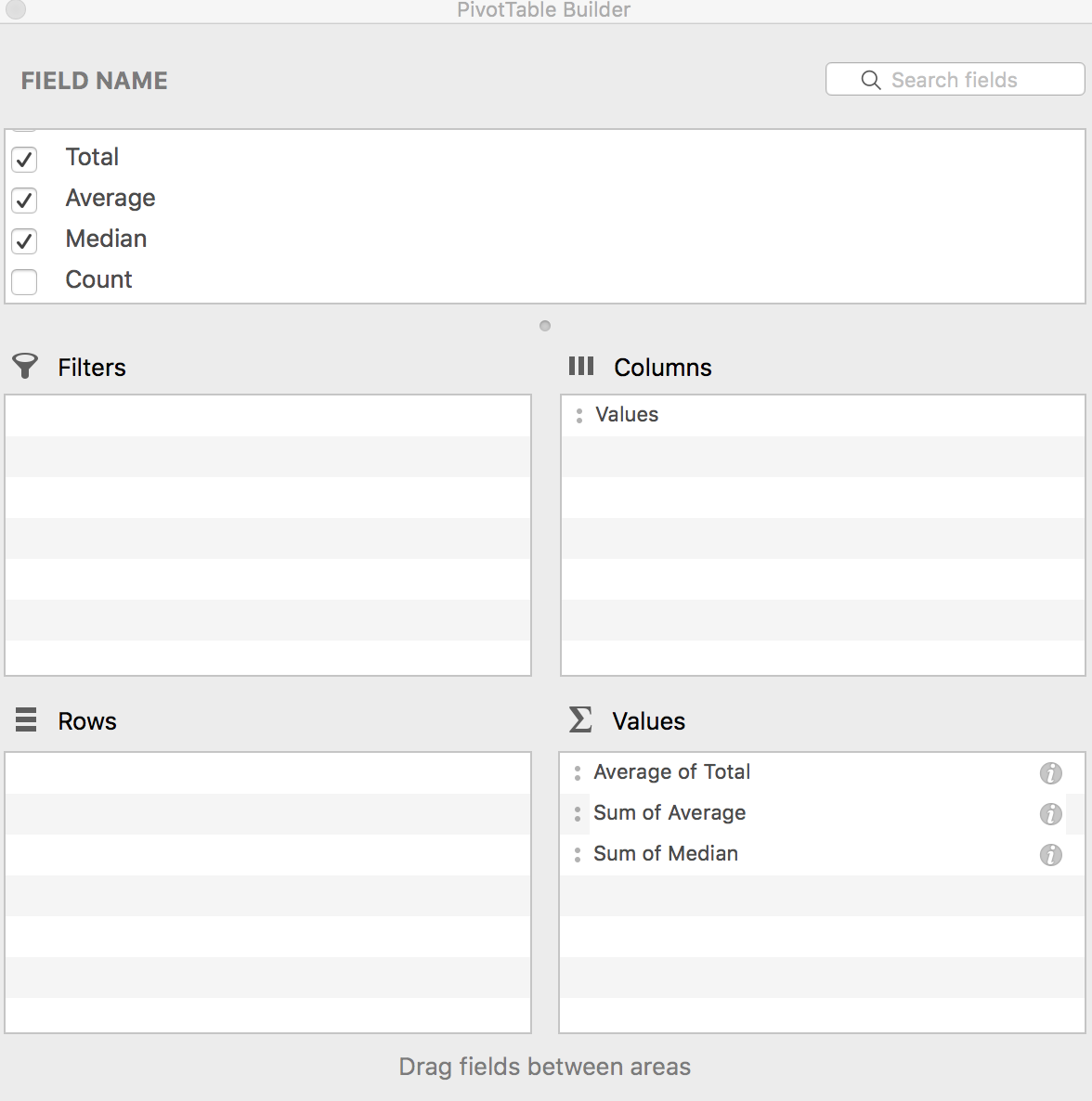
This will automatically take you to another sheet, where another window will pop up called “PivotTable Builder.” Here is where you actually create your pivot table, and what you want included. There are 100s of ways to do this with the information we have based on what you want to get from your pivot table, so I am just going to show you one quick way to get a snapshot summary of the entire table.
Let’s say for our purposes we aren’t interested in the specific day data, but rather want to look at the larger picture of the full 5 days for the artist. Therefore, we are just going to look at things like average, median, and total. I want to know the average values for those for all of the days for all of the artists. What you can do is drag on the PivotTable Builder the “total,” “average,” and “median” from the Field Name section into the “Values” section. Again, you can choose any metric you want and can play around on where to place it, but this is just one specific way to do it.
Once those are dragged into the correct place, you will notice is automatically will go to “sum” of the metric, which isn’t what we want here. We want the average of the whole data set. But don’t worry, it’s really easy to change. Simply click the “I” symbol next to them, and another window will pop up that allows you to change it from sum to a number of other metrics, including average. For now, let’s just hit average. This is what the PivotTable Builder table will look like ideally:
Once this is set up, you can exit out of it and you will see the pivot table on the new sheet. This very quickly gives us a lot of information. We know that the overall average for the data for all of the artists, including each day, is 10.4. We know the average total is going to be 52, and we also know the overall average median is 8.7. Within a minute, we were able to get general statistics for our data set, and this is useful for multiple reasons. For us here, a huge advantage of this is we can quickly compare individual artists’ data to the overall data for the group. For example, going back to our original data table, we can look at Artist 1 and see the average for them is 12.4 for the 5 days. That is way higher than the group average of 10.4, and we can immediately see that Artist 1 is preforming higher than the average. We can look at Artist 3 and see that the total was 40, and compare that to the average total for the group of 52, and we can conclude that Artist 3 preformed a lot lower compared to the other artists.
Practicing using a Pivot Table and coming up with conclusions is a great way to understanding how to analyze large amounts of data very quickly and very efficiently. This is especially important if you are dealing with 1000s of data points, and can’t eyeball each individual Artist to make conclusions. In order to become more effective at doing these, I would (as always), recommend for you to play around with this tool yourself, using the other metrics so you can figure out how to make the Pivot Table that works best FOR YOU. Excel has multiple ways to find information and preform functions, and it’s important you figure out what you like and what works easiest for you, so you can stick to those methods and become A PRO.
Of course, I would love to thank you guys for sticking through these excel lessons with me, and I’m so proud of all of you who have made it this far. I KNOW that you are on the best path to becoming an excel superstar. Never give up- you will get there with patience and with practice.

Until next time, future excel champs,
Your favorite excel teacher, Zoe