Personal Brand Development: Part 2
In terms of designing the visual side of my own personal brand, I went back to my key words in order to design my own logo on Canva. I also took advice from a Canva article that says that “[a] successful logo is the anchor of a brand and its design should represent a brand’s philosophy” (Guerrero, 2018).
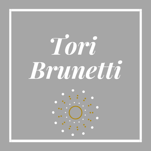
My words are classic, relatable, and aesthetic. When I first logged into Canva, I was overwhelmed by design choices. There are so many different stylistic paths to take, but I had to keep my key words, my philosophy, at the forefront.
So, I first started with the logo shape. I initially felt drawn to a circular shape. It is basic and easy to work with. However, in taking Megan’s advice that a brand is more than a logo, I began to consider how this circular shape would look in ads, email signatures, and business cards. I then thought that a square shape would be more aesthetically pleasing and easier to work with. So, I decided on the clean lines of a square shape with a nice border.
I then moved on to the color. Of course, my personal preference is initially pink. It is my favorite color! However, I had to remember that my brand is not just about me—it’s about the perception of my future followers. Would a pink logo alienate certain audiences? Would it make people think that my brand is strictly feminine and unrelatable? My mind then went to a cool gray color. I think this color choice reflects my aim to be classic and relatable.
I chose a font that I believed to be easy to read, which was very important to me. In terms of personal branding, my name is my identifier and my brand. I want it to be clear. While I love the look of cursive and elaborate fonts, they can be incredibly difficult to read. I wouldn’t want people to not immediately know how to spell my name or think that the font choice is impractical.
Lastly, I picked a simple graphic that I believe is “aesthetic.” It is simple, playful, and not too large. It would be an easy graphic to use on various forms of advertising and social media, and I think that it is much more unique than using a simple graphic like a heart or a star.
Overall, these choices took time. While the logo looks so simple, it required a lot of thought, consideration, and various trials in order to find my perfect fit. I will say that I definitely enjoyed getting a taste of the design process and having control of what my personal brand will look like.
While branding is more than just a logo, a logo is definitely a good place to start!